Working with the portal engine in Kentico support the kind of rapid development that bring visible results to the client quickly. In this post, I'll show you how using a combination of Web Part layouts and Widgets allow you to create structured reusable components to add more velocity.
Overview
Widgets offer your CMS users the ability to add structured content elements to their pages within the Portal Engine in Kentico. As developers, we know that a widget must be based upon a web part. At Ridgeway, we typically create a web part for each type of widget we need.
During rapid prototyping, it can sometimes be cumbersome creating multiple web parts to support he widgets that are needed. This is especially so when working in web application projects on a shared database.
In this example, I’ll set-up two widgets; one simple CTA (call to action) button and the other, a more visually pleasing CTA banner.
Setting up generic web parts and widgets
Below are the steps I’ve used before to create the generic widget/web part set-up. I’ve followed these steps on the Dancing Goat sample site in Kentico 10 (to save time, you can download an export of the Kentico assets and import them into your site)
Creating the generic web part
The first part of this process to create a new web part. This is done through the Web parts application; simply select the category for the web part (I’m using General) and click the New web part button. Fill in the resulting form as follows:

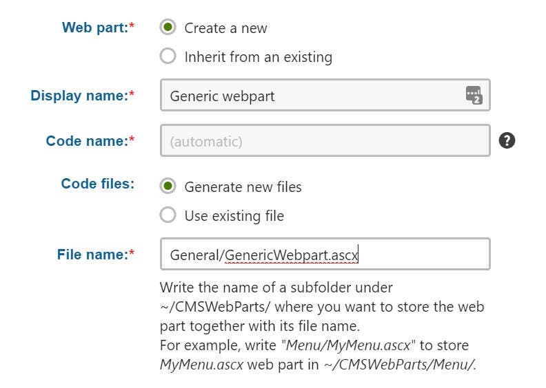
Kentico will create the required files for your solution and create the web part in the system. So, we’ve got a simple web part with absolutely no properties whatsoever.
Note: If you’re using a web site application, you’ll need to add these files to your project prior to building the solution. In this example, the files can be found in the CMS\CMS_WebParts\General folder.
Add the layouts
Now that we have a simple web part, we can take a look at the web part layouts.
Web part layouts can be used to change the way that a web part is displayed. They are also used to create new widgets based upon the associated web parts. We’re going to create two layouts for this demo as follows:
CTA banner layout
- Switch to the Layouts tab and click on the New layout button
- Give the layout a display name of Call to action banner and add the following layout code:
In this code you can see things like this <%= GetStringValue("LinkTitle", "") %>. Here we are accessing properties that do not exist in the web part, these will be coming directly from the widget itself.
CTA button layout
- Switch to the Layouts tab and click on the New layout button
- Give the layout a display name of Call to action button and add the following layout code:
And some CSS to make it look almost pretty:
Create the Widgets
Now we have a web part with a couple of layouts we can go about our business and create widgets that our editors can use. These widgets will use the layouts defined above and will also have the relevant properties created in each widget to satisfy the properties requested in the layout.
For this, I’ve again turned to the General category to create my two widgets. The following steps will create them:
CTA banner widget
- Open the Widgets application and select the General category in the tree view.
- Click the New widget button and select the General/Generic webpart web part.
- In the General tab, change the following properties:
- Display name: Call to action banner
- Code name: (Delete this so it can be automatically generated)
- Layout: Call to action banner
- Click the Save button.
- In the Security tab, make sure that Allowed for is check for the This widget can be used in editor zones.
- In the Properties tab, add the following properties
- Field name: LinkTitle
- Data type: Text
- Required: true
- Field caption: Title
- Form control: Text box
- Field name: LinkDescription
- Data type: Text
- Required: true
- Field caption: Description
- Form control: Text box
- Field name: LinkImage
- Data type: Text
- Required: true
- Field caption: Image
- Form control: URL selector
- Field name: LinkText
- Data type: Text
- Required: true
- Field caption: Link text
- Form control: Text box
- Field name: LinkUrl
- Data type: Text
- Required: true
- Field caption: URL
- Form control: URL selector
- Field name: LinkTitle
CTA button widget
- Open the Widgets application and select the General category in the tree view.
- Click the New widget button and select the General/Generic webpart web part.
- In the General tab, change the following properties:
- Display name: Call to action button
- Code name: (Delete this so it can be automatically generated)
- Layout: Call to action button
- Click the Save button.
- In the Security tab, make sure that Allowed for is checked for This widget can be used in editor zones.
- In the Properties tab, add the following properties
- Field name: LinkText
- Data type: Text
- Required: true
- Field caption: Link text
- Form control: Text box
- Field name: LinkUrl
- Data type: Text
- Required: true
- Field caption: URL
- Form control: URL selector
- Field name: LinkText
Putting it all in to action
We now have all the component parts, so let’s see them in action. Simply load up the Pages application and navigate to the Home page. In the Page tab, in here I’m going to add one of each of our new widgets to the web part zone where the Our Story content lives. I won’t go in to my settings, as they’re self-explanatory, but once you’ve added them in, you’ll get something that looks like this:

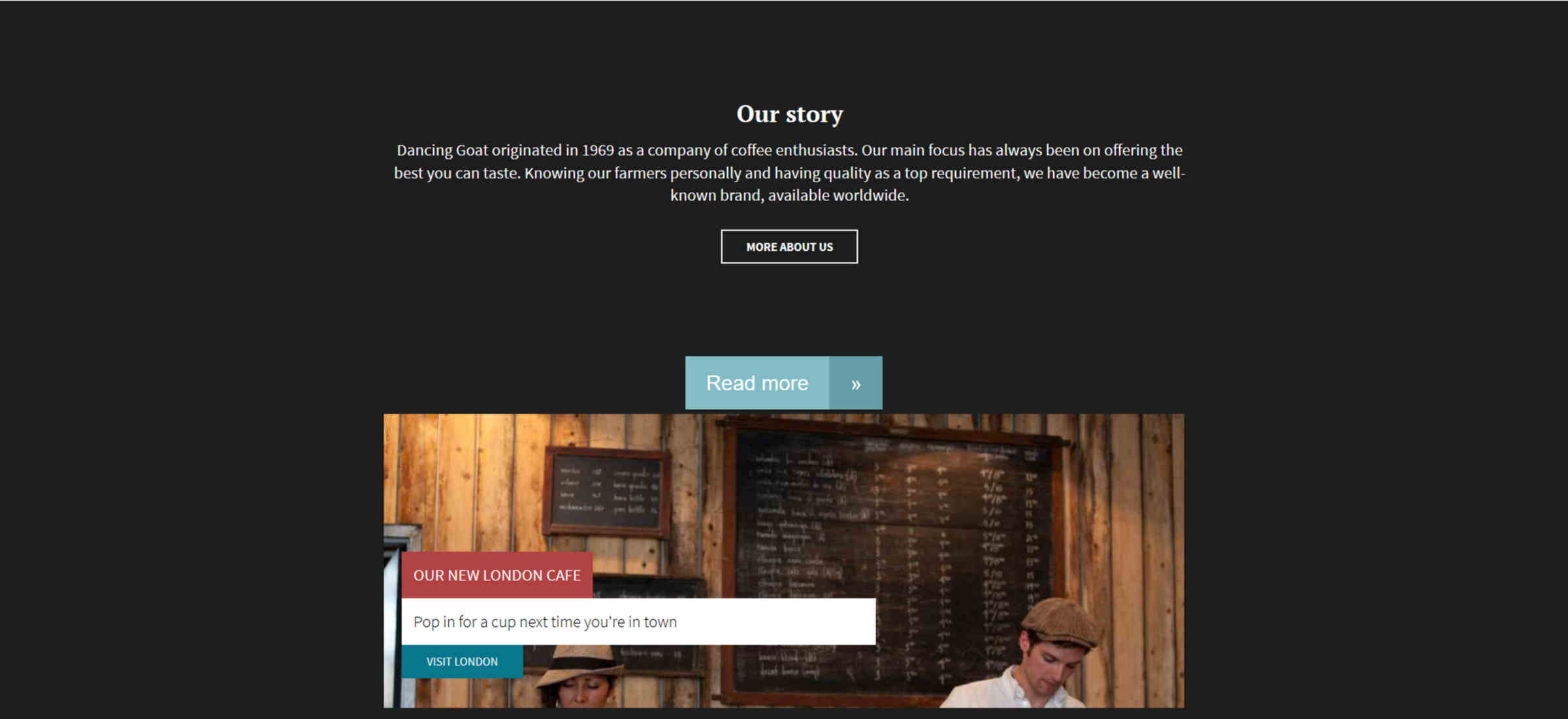
This is just a simple demo, but keep in mind that the complexity of these widgets can vary. In one instance over 15 layouts on a web part ranging from CTA though to image sliders. Not all of them need properties, some pull from the context of the page. In example of the slider, looking at an attachment group on the page.
Summary
This approach is a fantastic way to get some rapid prototyping done without the need to leave the administration pages in Kentico and – in light-weight scenarios – can be a good way to quickly build your site up.
Do take note that if you're creating a multi-lingual site, this may not be for you. Widget properties alone are not supported by Kentico's Translation Services, as only the web part properties are available to translation. So, if you're not careful you end up with a bunch of content that you cannot push through translation services.